
Building a Web and Mobile Design System
12 minute read

Thomas Fuzesi
At Countingup, we're not just about saving small businesses from the perils of crunching numbers and filing tax returns - we also want to deliver a cohesive and delightful visual experience across our web and mobile interfaces.
To coordinate this, we needed a centralised system, accessible by all, to help cultivate a unified language and mutual understanding around our design building blocks between our design and engineering teams.
Enter the design system
Simply put, this is a highly visible collection of reusable components and tokens, guided by clear standards, used to build a consistent UI experience across any number of applications.
What we hoped to get out of a design system was the following:
- Re-usable components - we would save time re-building similar components again and again.
- Design tokens - hex codes, spacing and typography are all agreed and standardised - no more magic numbers! More info about design tokens.
- Consistent look and feel - the user experience should be consistent between mobile, mobile web and desktop web.
- Streamline design process - better visibility of existence/status of components and designs. Helps with estimating work.
- Educational tool and reference - new and old team members alike can easily see which components we have and how they work.
- Document guidelines - keeping guidelines on our design principles and choices, including tone of voice and simple wording in our copy.
- Maintain order when scaling - as our products and team grows, we need to ensure that we can bring order to the chaos!
To bring this into reality, we had to do some investigation to figure out technical requirements and constraints.
Technical needs
We had some technical requirements to begin with, such as using React for our web apps and React Native (Expo) for our mobile app, so our design system solution would need to render both of these types of components.
After some investigation and prototyping, we came up with a full list including some constraints:
- We need both web (React) for mobile and desktop and mobile app (React Native) components in the same storybook.
- We need it to be easily accessible via web browser by all Countingup staff.
- We want all the code in one place (monorepo).
- We want to take advantage of an extendable component library.
- We can't use storybookjs/react-native as it is not representative of the components running in a mobile environment.
- We want an easy local development workflow (hot reload and build, import and test components in another project before publishing).
High-level decisions
We hadn't seen this done exactly as required anywhere, so we knew that we were in for a challenge!
To fulfil these requirements, we decided on using Storybook as it is the leading tool for building and presenting a design system. We chose to use Lerna for managing and publishing our monorepo, but we could have used yarn workspaces. Chromatic, a SaaS product made by the Storybook team, was chosen to host the Storybook. It deploys to a secure URL which requires GitHub login, has a simple publish API, keeps a history of versions and provides visual regression testing.
We didn't want to start from scratch when building components, so for web we mostly wrapped MUI and for mobile we went with React Native Paper. The reason we didn't just use these libraries and call it a day is because these are customisable UI component libraries. We needed a complete system with brand and design guidelines and principles to be followed by designers and engineers to build consistent user interfaces.
For the mobile components, using storybookjs/native means that components will be rendered in an emulated device that runs in the browser and will show exactly how components will look on a mobile device. For this, we will use the service Appetize to host the emulated devices on which we will render our React Native components.
Finally, making the development experience pain-free was probably the most painful part of the solution, mostly due to Lerna, Expo, Storybook and the other tooling having conflicting requirements and dependencies being hoisted. In order to have hot-reload and an easy way to build, import and test components in other projects, custom scripts and a lot of fighting with config files was done, but more on that later.
Repo layout
Inside our monorepo we have 3 packages to be published to our private package repo. These are the core package, the mobile package and the web package.
The core package contains the design tokens and shared assets between web and mobile, such as the colours, spacing and typography.
The web package contains React source code for each of the components. The mobile package holds the React Native components.
design-system
     |- packages
            |- app
            |- core
            |- mobile
            |- storybook
            |- web
We also have the app and storybook packages that are not published to the package repo.
The storybook contains all stories for web and mobile and is built and pushed with CI to Chromatic.
The app package is a lightweight mobile app built with Expo and published on Appetize, but can also be run locally while developing.
It is used to render the mobile components.
Initial components to build
It was important to set a good example to the rest of the team by building some core and widely-used building blocks and components first. This would both help with proving the concept of the design system and be used as an educational tool for how to build other components.
Colours
Firstly, we needed colours as every other component would require them. We already had a wonderfully maintained colour palette in Figma from our design team. The colour palette used in practice by our developers was a lot more loose in comparison, so with some inter-team communication and careful planning we drew up a rainbow of creatively named hex codes.
We've imported the core packaged into the blog and added the colours to the Tailwind config so that we can use the
colours in this blog - please admire this Cash Green text! We don't use Tailwind for our web apps but this doesn't
matter - our core package is platform-agnostic and is where we keep everything that can be used in mobile and web.
Typography
Typography was also crucial, not only for messaging in paragraphs and titles used throughout the app, but also for labels in most other components such as buttons.
Icons
Icons are also widely used and simple to add from Figma once the approach is figured out.
The exported .svg files are converted to .tsx with a script and yarn package, and this process was important to get right early so that others can easily add to the list of growing icons.
Buttons
Finally, we needed some actual React and React Native components that did something interesting.
We chose the Button and FunctionalButton as they are widely used in almost every screen, will have a big impact from the start and aren't too complex.


With these components as examples, we would have a strong foundation to build on and socialise the design system with to the rest of the team.
Storybook layout
We looked at a lot of other storybooks for inspiration. These included the BBC, gov.uk, Talend and Reaviz to name a few.
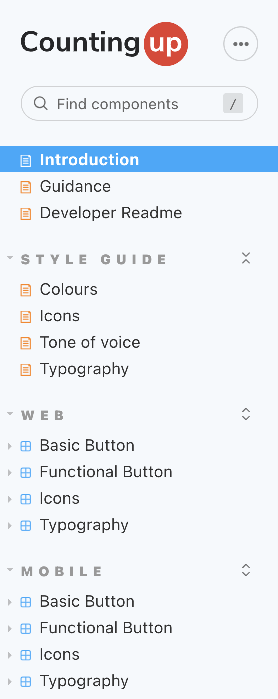
The layout we came up with looks a bit like this:
-----------------
Introduction Docs
Guidance
Developer Readme
-----------------
Style Guide
    Colours
    Icons
    Tone of voice
    Typography
-----------------
Web
    Component1
    Component2
    Component3
    ...
-----------------
Mobile
    Component1
    Component2
    Component3
    ...
-----------------
The first section of Storybook includes the landing page with a piece introducing the design system, guidance for contributing (both developers and designers) and the developer readme (not so important for designers).
The next section contains all the core, shared and non-component documentation, including colour palette, icons and tone of voice when writing copy.
The next two sections are the components, split between mobile and web. Each component has a number of stories in the Canvas tab and documentation with style and usage guidance in the Docs tab.
Stories and documentation
The stories should show most of the main component states, although it is important not to go overboard and show every possible combination of props. For this, there is a Controls panel which allows props to be manually changed to achieve any possible combination and component state. It should be noted that some states, such as hover or active for buttons, cannot be shown.
Stories are written using CSF 3.0, which is Storybook's Component Story Format Version 3, which looks a lot neater as much of the boilerplate from previous story formats is removed.
// Component.stories.tsx
import { ComponentMeta, ComponentStoryObj } from "@storybook/react";
import { Component } from "@countingup/design-system-web";
import { Docs } from "./Component.mdx";

export default {
  title: "Web/Component",
  component: Component,
  parameters: {
    docs: {
      page: Docs,
    },
  },
} as ComponentMeta<typeof Component>;

export const Contained: ComponentStoryObj<typeof Component> = { args: { children: "Contained", variant: "contained" } };
export const ContainedDisabled: ComponentStoryObj<typeof Component> = {
  args: { children: "Disabled", variant: "contained", disabled: true },
};
The documentation is not auto-generated by Storybook (as default).
Instead, we use .mdx files imported into the .stories.tsx file for greater flexibility in the layout of our documentation.
We can add paragraphs, images, stories and code anywhere and in any order throughout the page. We can even embed React components directly!
Code snippets in the documentation are also extremely important for adoption and education of the wider development team.
With this, there should be no excuses for not knowing how to use a component as it's now as simple as Copy+Paste.
Storybook has a nice addon for generating these code snippets automagically, by simply wrapping the stories in a <Canvas></Canvas> block.
// Component.mdx
import { Canvas, Story } from "@storybook/addon-docs";

<Canvas>
  <Story id="component-name--story-name1" />
  <Story id="component-name--story-name2" />
  <Story id="component-name--story-name3" />
</Canvas>;
The Docs tab for the Button component looks something like this, with code that can be shown/hidden.
Developing and Testing
For web, it's simple to test all states of your component within the Storybook render during development. However, sometimes things are overlooked such as the behaviour of a component once placed in a real app within a hierarchy of other elements, particularly the CSS. For this reason, we made it easy to build, import and test components by just running a yarn script.
For mobile, the same script can be used to build and import the output into another project for testing. However, it's a little trickier for developing in the first place as either a real or simulated mobile device is required to render the components. Usually, an iOS simulator or Android emulator is used, but which app to run on them?
This brings us to the app package mentioned earlier. It is a lightweight Expo app that consumes deep-links in order to decide which component to render and with which props.
The components are imported from the mobile package and the deep-links are generated and sent from Storybook. More on deep-links here.
com.countingup.design-system://link?component=FunctionalButton&props=%7B%22label%22%3A%22Label%22%2C%22disabled%22%3Afalse%7D
Publishing
For the core, web and mobile packages, publishing is as simple as bumping the version number with a yarn script and merging the PR.
Our CI notices the new version number on the master branch, then builds and publishes the packages to our private package repo.
If changes to the app package are detected, EAS builds a new iOS and Android binary which are pushed to Appetize.
Similarly, the storybook package is built and pushed to Chromatic where automatic visual regression tests are done.
The new components and stories are available shortly on Chromatic (through a dedicated design system subdomain). For the web components, they are simply rendered inside Storybook. For the mobile components, an instance of the Appetize mobile device running the lightweight app is embedded in an iFrame inside Storybook and started up, ready to receive the deep-links.
How it's going
Since launching, we've seen a complete adoption of the design system into our way of working. Everyone appreciates the visibility and collaboration it promotes to the design and development teams. We now have almost 20 components each built for mobile and web, fully documented with code snippets and in-use in our production apps.
For this to be a continued success, we have adopted a steady approach for migrating pre-existing components built in our respective apps, into the design-system. With this approach, it never feels like a burden to add something new the design system during the usual development process, and older components can be moved when they need to be.
It's almost been a year with our design system - here's to many more!